1.7 Responsive Content
You are here Page Tree > Page Content.
When you have a Responsive design you need to make sure you also make the content Responsive. At first this may seem a little bit cumbersome but once you have tried it a few times it will get easier.
Here are a couple of general reules to remember when creating content:
- When creating content, Remember that it will need to function on a lot of different devices.
- Select the amount of columns with the "Template" button, before you begin (See more in the section below).
- Do not use Fixed/Static widths on content elements (e.g. Tables, Pictures and other elements).
- Do not use tables to "Position" your content (Try not to use tables, if you can).
- Upload pictures in a "large" version (e.g. 1000x1000 px), so they can be scaled down automatically for smaller devices.
- Upload pictures in squares (Same height and width).
In a Responsive design you will want to have, elements with different widths dependant on, which device you will be using.
For example: Pictures won’t have the same width (and size) on a smartphone as a standard computer. The same goes for the website/webshop menu for example - it can’t be the same width on a smartphone as a standard computer (There’s simply not enough space).
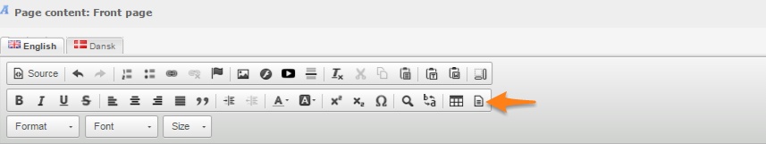
For a Responsive to work you have to use relative widths and not fixed/static widths. In practice you work with a column structure and you can do this by using the "Template" button. That looks like (See Image Below).